Misleading Graphs

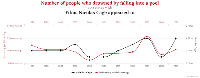
This graph comparing the number of people who drowned by falling into a pool and the number of films Nicolas Cage appeared in was taken from tylervigen.com/spurious-correlations .
As a person who wants to be informed of the world around them, being able to identify suspicious data and fact check is extremely important - it's very easy to mislead someone or to be misled by official looking graphs. The above graph, for example, draws a correlation between the number of people who drowned by falling into a pool with the number of films Nicolas Cage appeared in. If I didn't know better, this would be pretty conclusive evidence that Nicolas Cage appearing in films is causing more people to drown in pools. I have enough common sense to know that Nicolas Cage's movie appearances do not noticeably influence the number of people who drown in pools, and vice versa.
The problem with this data lies in how it is presented - the person who organized and graphed this data used two x-axes to make the number of films Nicolas Cage appeared in seem to match the number of people who drowned in pools each year. The different x-axes allow the data to seem the same, and lead you to a false conclusion.
Because this graph was almost intentionally designed to be misleading with the separate x-axes, it's very hard to fix this graph to show anything meaningful. If we held a consistent x-axis for all the data, Nicolas Cage's films would almost appear to be a straight line. A consistent x-axis would definitely fix the problem of the graph being intentionally misleading.
Website Cited -
Vigen, Tyler. “15 Insane Things That Correlate With Each Other.” Spurious Correlations, 2013, www.tylervigen.com/spurious-correlations.
It is very interesting how they try to link those two sets of data together. This graph is very misleading as the incident of drowning in a pool would not depend on a person appearing in movies more often. I like how you explained why the graph was misleading and how they are inconsistent becasue of the different axis’ on the graph. I feel this was a very successful blog post, and can not think of a constructive response that could possibly help you improve it.
ReplyDeleteBen, I completely agree with you that there is no causation when it comes to watching Nicolas Cage's movie and drowning in a pool. However, I do not see the miss match between the X axis as you mentioned it in your blog. When it comes to variables being correlated, all it means is that two variables behave the same way. It does not mean one caused the other one to happen. There is no problem with showing correlation among different variables as long as we don't blindly suggesting one causes the other to happen. Causality needs experimentation and data collection. I would appreciate if you show me how the x-axis has been manipulated.
ReplyDelete